Logo
The wordmark is the primary signature of Ultromics. It should read calmly and legibly at any size — on a report header, a conference badge or a hospital display.


Clearspace
Keep space equal to the cap-height of the wordmark free on every side. Nothing else — text, edges, imagery — enters that margin.
Minimum size
Never render the wordmark narrower than 90px on screen or 22mm in print. Below that, legibility of the type breaks down before the mark does.
Don't
The wordmark only appears in its original colors. No tints, no gradients, no hue shifts.
Scale the lockup uniformly. Never stretch, skew or condense it to fit a space.
No drop shadows, outlines, bevels or animation applied directly to the mark.
Set the mark on a white plate (as above) whenever the background isn't light — never directly on Navy or photography.
Product brands
Each EchoGo® product carries its own heart-icon mark, distinct from the corporate Ultromics logo. The icon's colors and pattern are unique per product and are never reused as general brand colors elsewhere — they identify that specific product only.


Both product marks keep the shared "Echo" (Oxford Blue) + "Go" (Polynesian Blue) wordmark treatment and the same registered-trademark placement, so the family reads as one system even as each icon stays visually distinct.
Color
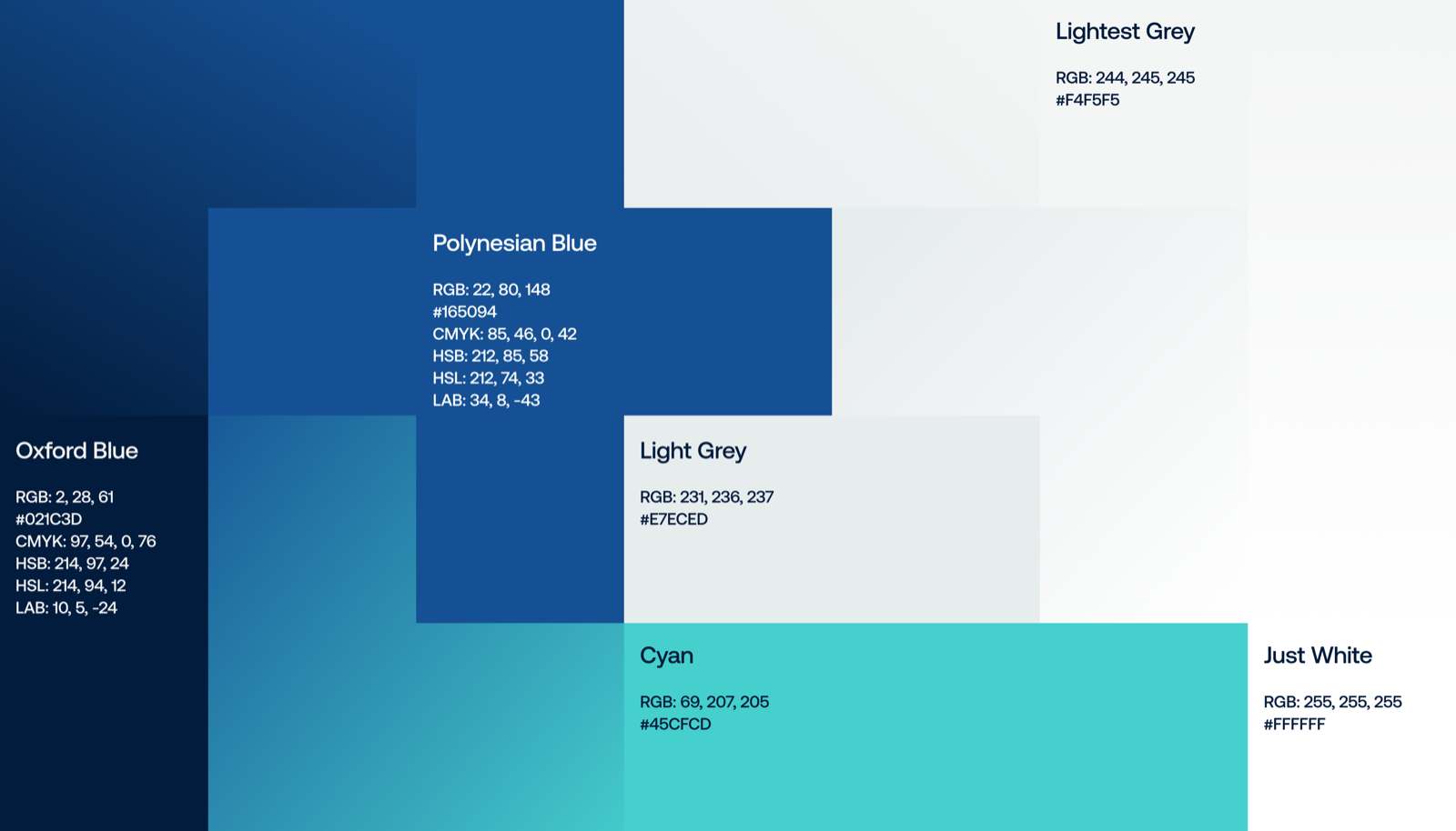
Oxford Blue carries authority; it's the color of the mark and of primary UI chrome. Polynesian Blue does the day-to-day work of links and interactive states. Teal is a signal color — reserved for surfacing an AI finding or a key metric, never for decoration. Click a swatch to copy its hex.
Approved contrast pairs
Teal is never used for body text — reserve it for the numeral in a metric, a status dot, or a single accent stroke.
Gradients
Five blends between neighboring colors, light to dark — for a hero panel, a section divider or a chart fill. Always step between adjacent swatches in this order; never jump straight from Oxford Blue to Signal Teal. Click a tile to copy its CSS.
Color in practice
An asymmetric block pattern built only from the approved palette — a way to bring the colors into a cover slide, a section divider or a hero panel without borrowing an off-brand hue.
Typography
Aeonik is the only typeface. Its even, geometric forms stay legible at clinical-report sizes and hold their own as a display face — one family means one less decision under deadline.
Aeonik is a licensed typeface from CoType Foundry, self-hosted here via @font-face. Four weights are licensed for use — Light, Regular, Medium and SemiBold, each with an italic — so SemiBold stands in for Bold wherever extra weight is needed.
Weights in use
Medium carries every display size and headline — it reads calmer than a bold weight at large sizes, which suits a brand built on evidence rather than volume. SemiBold is reserved for subheads, metrics and buttons, where a touch more weight helps something stand out inline.
Evidence & data
Numbers are the most Ultromics thing on the page. Give each metric room, pair it with its qualifier, and always cite the source in the same breath — never as a distant footnote link.
Reported under intended-use conditions. See FDA 510(k) K240013 for full results.
Rules for a metric callout
- The number is set in Navy, bold; its unit is set in Teal, one weight lighter.
- A one-line label sits directly beneath — what was measured, not what it proves.
- A citation in Slate, 12px, sits under the group — never smaller, never omitted.
- Teal appears once per metric group. Repeating it across every number flattens the emphasis it's meant to create.
Imagery
Photography should feel like a real clinical morning — echo labs, monitors mid-read, a clinician actually looking at the screen. Not a stock handshake, not a lab coat posed for the camera.

%20Large.jpeg?noresize&width=478&height=640&name=Patient%20discussing%20results%20(1)%20Large.jpeg)
- Natural light and real equipment over staged studio lighting.
- Diverse patients and clinicians, shown with the same dignity in every case study.
- Screens and waveforms may appear soft-focus in the background — never as the hero unless explaining the product.
- No stock imagery of glowing brains, abstract circuit boards, or generic "AI" iconography.
- No graphic clinical imagery. Findings are conveyed in words and charts, not distressing visuals.
Icons
A consistent set of navy line icons for use across product UI, decks and clinical materials — twelve of the 144 available are shown below. Same stroke weight throughout; never mix with a filled or duo-tone style in the same view.












- Stroke only, never filled — keep the line weight consistent with the set.
- Recolor with brand colors only (Oxford Blue, Polynesian Blue, Mist) — never an off-palette hue.
- Don't add drop shadows, gradients or outlines to an icon stroke.
- Give each icon room to breathe — don't crowd a row past what a clinician can scan in a glance.
144 SVG icons, navy stroke on a transparent background.
Animation
Motion explains a process or reveals a number — it's never decorative. Every animation resolves to a static, legible end state and holds there; nothing loops indefinitely in product.
- End on a static frame that reads fine as a screenshot — motion is a bonus, not the message.
- Ease out, never bounce or spring — the calm reads as clinical confidence, not enthusiasm.
- Reserve motion for a finding, a metric or a product name — never for a logo, a button or a transition alone.
- Keep a full sequence under 4–5 seconds; a metric reveal under 2.
Components
A small, disciplined set of UI parts carries the brand into product and decks alike.
Buttons
Status badges
Card
EchoGo® Heart Failure
Advanced AI for identifying patients with HFpEF from a routine echocardiogram.
FDA ClearedSample assets
A few executions already live on ultromics.com, annotated for the patterns worth reusing.
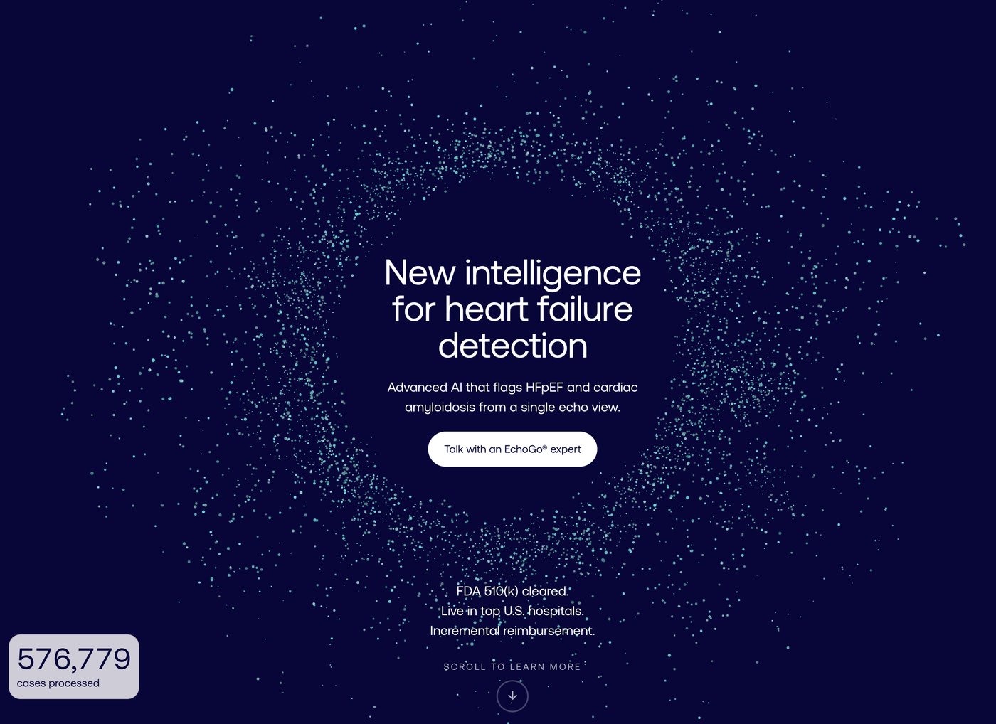
The particle ring is the one piece of motion-adjacent decoration the brand allows itself, and it appears only here — on the primary homepage hero, never repeated on interior pages. A single solid CTA carries the hero, unpaired, since there's no secondary action competing for attention. The floating stat card breaks the hero's edge deliberately, the only element in the system allowed to overlap a container boundary. Credibility claims underneath run as three short plain-text lines, not badges — badges are reserved for regulatory/product status, not general claims.
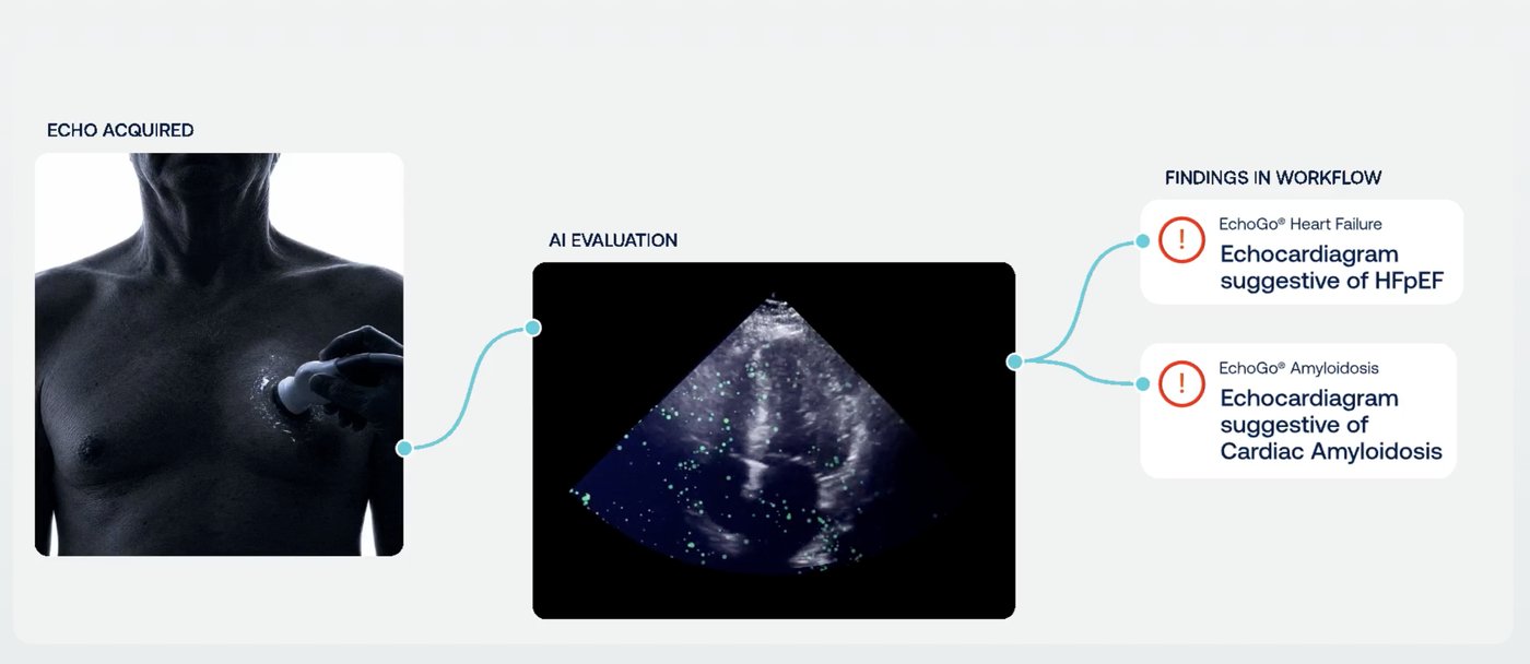
The workflow diagram uses Signal Teal for the connecting line and status dots only — never for the alert icon, which stays a clinical red reserved for a flagged finding. Card headlines pair a small product label with a bold navy sentence stating the result in plain language.

EchoGo® Heart Failure takes a teal-green wash. The pill badge separates claims with a Signal Teal dot; the CTA pair follows outline-then-solid, never two solid buttons side by side.
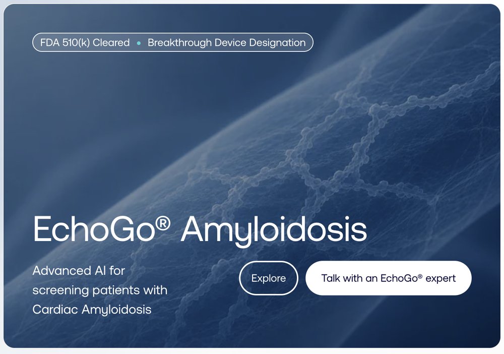
EchoGo® Amyloidosis takes a deep blue wash instead. Each product keeps its own background treatment so the two are never confused at a glance, while badge, type and button treatments stay identical.
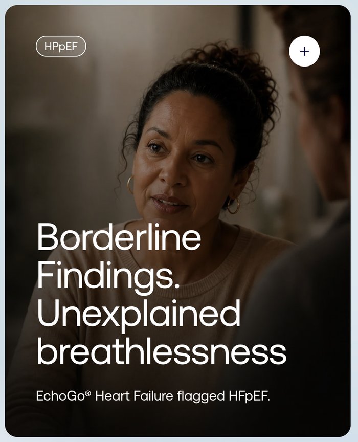
Case-study cards follow the same voice principles as everywhere else: the condition tag sits top-left as an outline pill, a circular "+" invites expansion, and the headline names the patient's real situation before the smaller line underneath states the finding plainly — "EchoGo® Heart Failure flagged HFpEF," not a claim of diagnosis.

The brand travels to print the same way it does on screen. On a dark navy ground, the particle-network heart motif from the homepage hero reappears at large scale, proving the visual isn't a one-off web effect but a reusable brand asset. The bullet list trades round dots for short vertical Polynesian Blue ticks — a lighter-weight variant for dense copy blocks where a full badge or icon would be too heavy. Both product logos sit side by side at the base, establishing the family relationship in a single glance for a booth visitor walking past.